These last few days I have done some editing of the Heart Note Alley chart, changing a few bands that weren't working for me. When I first put them together it was more to get an overall feel for the piece and now as I'm getting ready to put floss to fabric it is time to finalize the design. Though there will doubtless be some changes as I stitch the particular bands, I think I can safely say that the design is as final as it can be at this point in the process. And this is what it looks like.
I also spent a fair amount of time looking at silk floss considering possible colors. In our very rural area there are no brick & mortar shops I can go to to actually see floss so I ordered some online, hoping that the actual colors were close to what my monitor was showing. Thankfully, most were and after trying many combinations of possibilities, getting rid of the 'disturbers', I've decided the color palette.
For fabric I'm using Zweigart's 18 count Aida cloth in ivory. I've tried many types of fabric over the years and I come back to such an evenweave because I simply enjoy how it feels, looks and stitches. I have friends who do gorgeous work on linen and this design will hopefully work well on whatever type and count you might prefer yourself.
The floss I'm using is silk. Since first trying silk floss I haven't used anything else, again it is just what works for me. This time I'm using silk floss from both Vikki Clayton's Hand-Dyed Fibers collection and some from Carrie's Creation Threads
The palette will be three shades of green, three of mauve and two purples.
From Carrie's Creation - Wild Orchid (dark mauve), Violet (medium mauve) and Garden Green (dark green)
From Clayton's HDF - Wrasse #3315 (medium green), Wrasse #3313 (light green), Ultra Violet #2121 (light mauve), Sue-Purple #6115 (dark purple) and Sue-Purple #6109 (medium purple)
I began doing some sample stitches to see which color I want to use for the border, hopefully you can get an idea of what they look like in the photo below. The second group with the medium green won and will be the border.
As soon as I receive full skeins of the selected colors I'm more than ready to get started!
Thursday, December 30, 2010
Fabric & Floss
Labels: Cross Stitch, free, patterns, designing
Carrie's Creations,
HDF floss,
Silk Floss,
Zweigart
Monday, December 27, 2010
Those Tweener Bands
While the larger images are usually your inspiration and set the theme of the piece, it is those in between bands that can add a lot of interest to a design.
In designing Northern Nights I began to see that the narrower bands reminded me of something else from my quilting days, a favorite fabric, ticking! Not just the simple ticking of pillows and mattress coverings, but decorative fabrics that were made up of rows of varying types of stripes, many resembling ribbons.
Here is a lap quilt I made years ago and you'll see the block of fabric that displays this ribbon quality.
If you take a close then distant view of different patterns in your designing palette you'll find quite a few that can be cut from a larger whole and then repeated to form something that can give you that ticking/ribbon effect. You can add tumbling flowers or geometric shapes that can bring that sense of movement to your design.
Placed between your larger bands for division and symmetry, those 'tweeners' can really affect the overall design.
Labels: Cross Stitch, free, patterns, designing
Band Samplers,
cross stitch,
Designing Patterns,
Free pdf Pattern
Friday, December 24, 2010
Balance, Proportion, Rhythm, and Scale

Heart Note Alley began with an idea of the colors and the feeling I wanted to create in a band sampler. The next step was accomplished when I found the floral image that captured the sense of flow and movement that I was seeking.
Now it's time to begin gathering and crafting the images and lines that will help to balance the design and give it proportion and rhythm.
Years ago I took a beginners quilting class. I never made many quilts, due to it involving one of my mortal enemies - a sewing machine - but I did learn some important principles. Beginning with the importance of choosing the right fabrics for your design. Quilting inspiration can also begin with color but it is most important that the choice of colors contain contrast. Varying intensity of shades, a light, medium and dark, not necessarily of the same color, is what will give the design interest.
The other important ingredient is scale, everything can't be the same size. A really great quilt will have patterns of varying sizes. These will all relate to each other - shades & patterns, but they need to balance and compliment, not war with each other.
I have a friend who I believe is truly the most talented quilter in the world! She wins all of the prizes at the county fair and anyone who has seen her quilts are in awe of her abilities. What makes her quilts so remarkable is not only the obviously excellent stitching, but it is the sense of motion that she creates. They are positively dynamic! She achieves this by her exceptional ability to combine the right colors and the right scale of the fabric and then place them in ways that make your eye move from one part of the design to another and back again. Their rhythm is something to behold.
You are seeing Heart Note Alley midway through its evolution, it has already gone through multiple revisions as I placed the bands together, and may still change before it is completed. After each adjustment I hit the image reduction button so I can see the whole piece from a distance and that is what helps me know if the scale is working for me.

The image to the left shows one of the main bands in Heart Note Alley containing the iris, initials and date as I first put it together. However, as the design grew this band felt out of proportion and so I've changed the band increasing the number of iris and changing the size and placement of the date and initials. It now works for me and I hope you can see below how such a change improved the balance of the design.

Tuesday, December 21, 2010
Adding Images to Palette
I'm using Needleprint's Infinity design software and there are some charts that come with the program and some you can purchase and add to it. However, there is a way to create new images to add to your file palette by very simply 'cross-stitching' it onto a chart.
For example, the floral images I mentioned in the last post. I saved their images in jpeg files in My Pictures. I then edited them in the windows image edit function, encircling the part of the image I wanted as my basic piece. I then used edit to cut the rest away and printed that piece.
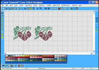
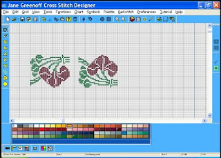
Using that print I called up a new chart in the software and with the painting feature I went back and forth from the printed image to the chart making my 'stitches' using my cursor. When it was complete as you see it on the left I saved it to my software's file. From that point you can repeat it on the chart by simply copying and pasting. As I did with the image to the right.
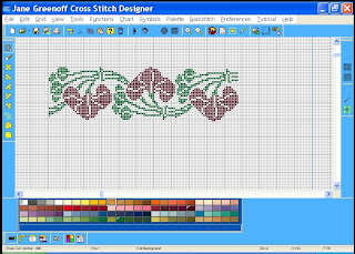
You can then encircle that right image, flip it vertically and drag it to the left to join with the first piece to make a swag continuing as many as you wish.
After doing this with the two 'anchor' images I wanted for the design, it was time to think about layout, and what I wanted to surround these with.
This brings me to the next post and what I believe is the most crucial part of design, scale.
For example, the floral images I mentioned in the last post. I saved their images in jpeg files in My Pictures. I then edited them in the windows image edit function, encircling the part of the image I wanted as my basic piece. I then used edit to cut the rest away and printed that piece.

Using that print I called up a new chart in the software and with the painting feature I went back and forth from the printed image to the chart making my 'stitches' using my cursor. When it was complete as you see it on the left I saved it to my software's file. From that point you can repeat it on the chart by simply copying and pasting. As I did with the image to the right.


You can then encircle that right image, flip it vertically and drag it to the left to join with the first piece to make a swag continuing as many as you wish.
After doing this with the two 'anchor' images I wanted for the design, it was time to think about layout, and what I wanted to surround these with.
This brings me to the next post and what I believe is the most crucial part of design, scale.
Images
At this point I know I want to do a design in shades of three colors - green, mauve & purple, that reflects more of a spring floral feeling. How do I find images that will express that?
First, I look at the downloads from Needleprint of the Beatrix Potter, the Ackworth School and some older European Borders. I found in Northern Nights that taking a piece here and there and then recombining them often gave me just what I was seeking. And when I've exhausted those, I turn to other sources.
Old crochet or filet patterns have a wide array of types of images that translate perfectly to cross stitch and there are some great ones you can find in old book stores or on ebay.
There are also some wonderful online sources for antique patterns. Two everyone should visit are - Antique Cross Stitch and Pattern Maker Charts
At the Antique Cross Stitch site I came across the two floral images that gave me that next step in inspiration, the shapes and scale, and I knew I had the pieces to begin the actual design.

The software does not allow me to simply import this image so it meant having to 'draw' or cross stitch onto a blank chart a portion of each of the florals then I used the software to extend the piece into a band length. We'll take a look at that in the next post.
First, I look at the downloads from Needleprint of the Beatrix Potter, the Ackworth School and some older European Borders. I found in Northern Nights that taking a piece here and there and then recombining them often gave me just what I was seeking. And when I've exhausted those, I turn to other sources.
Old crochet or filet patterns have a wide array of types of images that translate perfectly to cross stitch and there are some great ones you can find in old book stores or on ebay.
There are also some wonderful online sources for antique patterns. Two everyone should visit are - Antique Cross Stitch and Pattern Maker Charts
At the Antique Cross Stitch site I came across the two floral images that gave me that next step in inspiration, the shapes and scale, and I knew I had the pieces to begin the actual design.

The software does not allow me to simply import this image so it meant having to 'draw' or cross stitch onto a blank chart a portion of each of the florals then I used the software to extend the piece into a band length. We'll take a look at that in the next post.
Monday, December 20, 2010
Heart Note Alley

As I was designing and stitching Northern Nights another shape kept crowding my brain. This time it took the shape of another passion of mine, fragrance! Scent is a sense that is so immediate, going right to our brain affecting us like color does almost before we can think about it.
If you aren't familiar with the world of scent, fragrances are usually built in a pyramid and the notes are designated as top notes - the ones you smell first, the lightest and shortest in duration. The mid or 'heart' notes are those in the middle and are what the scent is most often known for. The bottom or 'base notes' are the foundation that holds up the fragrance, gives it it's drydown scent and is what helps to classify the scent as an oriental, chypre, gourmand, woods, etc.
The heart then is very often floral and yet you also have to have structure to support those notes, so I 'saw' a design that was both floral and geometric and flowing as if wafting out its aroma. So where does the 'alley' come from? From my favorite fragrance forum, Make Up Alley's fragrance board. I also like the feel in band samplers that you have of paths, so paths became an alley for this design.
That explains why it is called what it is and why it looks the way it does, at least I hope I explained it so you can see it somewhat as I do. Keep in mind that this chart is still in the designing process, I may move/change some bands and the colors are preliminary, those I know I'll move about as I actually begin stitching - which I hope to do soon, just waiting for some floss to arrive.
Next post - Finding/Creating Images
Sunday, December 19, 2010
Inspiration
What moves you?
If something moves you, it can inspire you. Now to capture that inspiration and turn it into a design, it doesn't have to be an exact representation, in fact it is often more interesting if it isn't.
With Northern Nights it was my love for winter and home and hearth that brought images to mind and while some of those actual things made their way into the design, cats, teapots, snow. It was also how those things feel that I wanted to express and I think color is one of the most powerful ways to accomplish that. I wanted the cold of the blues and the warmth of the golds to be felt before the parts of the design would be recognized.
Color is so incredibly powerful. I was reminded of this recently watching a dvd of one of the BEST examples I've ever seen of the use of color in a design. If you'd like to see what I mean, rent a copy of the Eugene Onegin opera filmed at the Metropolitan Opera, starring Renee Fleming. The set designer used a very minimalist style, but the Colors are astounding! They express the time, the place, the emotion of every scene. The use of the vibrant autumn golds, the purples and blacks, the green and browns of background and costumes are all a key part of what makes this one of the most highly recommended operas on dvd. Those colors pierce you and move you directly into the story and the glorious music.
And it is color that led me to the next design. After Northern Nights, I wanted to try creating something that brought spring to mind. We live where lilacs grow abundantly and I thought of shades of green, mauve and purple. How could that then be expressed in a design?
Next post - Heart Note Alley
If something moves you, it can inspire you. Now to capture that inspiration and turn it into a design, it doesn't have to be an exact representation, in fact it is often more interesting if it isn't.
With Northern Nights it was my love for winter and home and hearth that brought images to mind and while some of those actual things made their way into the design, cats, teapots, snow. It was also how those things feel that I wanted to express and I think color is one of the most powerful ways to accomplish that. I wanted the cold of the blues and the warmth of the golds to be felt before the parts of the design would be recognized.
Color is so incredibly powerful. I was reminded of this recently watching a dvd of one of the BEST examples I've ever seen of the use of color in a design. If you'd like to see what I mean, rent a copy of the Eugene Onegin opera filmed at the Metropolitan Opera, starring Renee Fleming. The set designer used a very minimalist style, but the Colors are astounding! They express the time, the place, the emotion of every scene.
 The use of the vibrant autumn golds, the purples and blacks, the green and browns of background and costumes are all a key part of what makes this one of the most highly recommended operas on dvd. Those colors pierce you and move you directly into the story and the glorious music.
 And it is color that led me to the next design. After Northern Nights, I wanted to try creating something that brought spring to mind. We live where lilacs grow abundantly and I thought of shades of green, mauve and purple. How could that then be expressed in a design?
Next post - Heart Note Alley
Subscribe to:
Posts (Atom)


